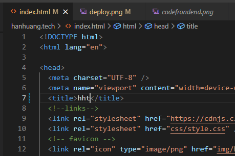
Various frontend techniques that were used to create this site

<meta charset="UTF-8">
By utilising a standardised character set UTF-8, <html> will accurately encode the characters used on this webpage.
<meta name="viewport" content="width=device-width, initial-scale=1.0">
By using valid viewpoint expressions, this webpage will resize elements correctly to accommodate various sizes of devices as it is displayed. This is an important meta tab to use for responsive websites.
<title>hht</title>
Adding a <title> to the top of a webpage adds description of its contents.
<link rel="stylesheet" href="https://cdnjs.cloudflare.com/ajax/libs/normalize/7.0.0/normalize.min.css">
Normalize allows our pages to be displayed correctly across various web browsers and fixes common bugs around <html> elements.
<link rel="icon" type="image/png" href="img/habbit-favicon.png"/>
Linking a favicon image from the images directory to this webpage will add more personality.
<link href="https://fonts.googleapis.com/css2?family=Inconsolata&family=Noto+Sans:wght@400;700&display=swap" rel="stylesheet">
Linking Inconsolata and Noto Sans fonts from Google fonts is a method to add characteristics to a webpage. Careful font usage here, with appropriate font weight, will accentuate texts used in normal paragraph reading, and also enhance readability in code.
:focus {
outline: 2px solid var(--clr-accent2);
outline-offset: 2px;
position: static;
z-index: 0;
border-radius: 2px;
}
Styling for :focus allows highlighting of the element that is being selected or that is under interaction from the user. Outline is offset by a few pixels to better emphasize the targetted element.
html {
scroll-behavior: smooth;
}
Smooth scrolling is applied to the entire of html, everything that the viewer sees.
<section id="splash">
<div class="flex-column">
<div class="flex-row">
<img src="img/habbit-a.png" alt="a pic of habbit" />
<h1>hanhuang.tech></h1>
</div>
<i>cloud / frontend</i>
</div>
</section>
Splash logo on top of blurred webpage that fades into the clear on the website.
#splash {
position: fixed;
z-index: 10;
opacity: 1;
visibility: visible;
display: flex;
justify-content: center;
align-items: center;
width: 100%;
height: 100%;
backdrop-filter: blur(10px);
transition: 1s;
transition-delay: 3s;
}
The splash screen is placed in front of all other elements, with the use of z-index: 10 and an animation of a blurred background backdrop-filter: blur(10px). The animation has a 1s transition time, after a delay of 3s.
<div class="logowrap">
<div class="logo">
<div class="habbit-img">
<img src="img/habbit-a.png" class="habbit-a" alt="a pic of habbit" />
<img src="img/habbit-a.png" class="habbit-b" alt="a pic of habbit" />
</div>
<a href="https://hanhuang.tech">hanhuang.tech</a>
</div>
</div>
This logo has 2 forms habbit-a and habbit-b, within the same class block. Through scripts this block alternates between one and the other. Additionally, there is a banner html child element within this parent block that redirects the user back to the home page, also activatable via scripts.
div.logowrap {
position: absolute;
z-index: 1;
top: 0;
left: 0;
}
div.logo {
position: fixed;
display: flex;
padding: 15px;
}
@media (min-width: 64em) {
div.logo {
padding: 20px;
}
}
div.habbit-img {
position: relative;
margin-right: 10px;
filter: drop-shadow(0 0 1px lightgreen);
outline-width: 1px;
outline-style: solid;
outline-color: var(--clr-dark2);
outline-offset: 6px;
transition: 1s;
}
div.habbit-img:hover {
filter: drop-shadow(0 0 4px lightgreen);
}
@media (min-width: 64em) {
div.habbit-img {
margin-right: 15px;
}
}
img.habbit-a,
img.habbit-b {
width: 35px;
cursor: pointer;
}
@media (min-width: 64em) {
img.habbit-a,
img.habbit-b {
width: 40px;
}
}
img.habbit-a {
position: relative;
}
img.habbit-b {
position: absolute;
opacity: 0;
top: 0;
left: 0;
}
The element logo acts as a container and styles children elements. Of child elements include img.habbit-b, that is initially styled as hidden until interacted by a script.
<div id="connectedwrap">
<h5 id="dynamic-rgb">0 0 0</h5>
<div class="connectedto">
<h5 class="connectedto">Connected to :AZ on :IP4.</h5>
<h5 class="connectedto">Connected to :AZ on :IP4.</h5>
</div>
</div>
The connectedto element features dynamic background colour with corresponding rgb html that changes with scroll. It also indicates information about the metadata of the backend the site is hosted on.
#connectedwrap {
position: fixed;
display: inline-block;
z-index: 1;
bottom: 0px;
left: 0px;
max-width: 65px;
overflow: hidden;
background-color: rgb(0, 0, 0, 0.5);
}
@media (min-width: 64em) {
#connectedwrap {
max-width: 80px;
}
}
#dynamic-rgb {
margin: 0px;
text-align: center;
color: var(--clr-light);
background: black;
}
div.connectedto {
display: inline-flex;
align-items: center;
white-space: nowrap;
overflow: hidden;
animation: marquee 5s linear infinite;
}
@media (min-width: 64em) {
div.connectedto {
animation: marquee 8s linear infinite;
}
}
h5.connectedto {
display: inline-block;
color: var(--clr-light);
font-family: var(--ff-secondary);
letter-spacing: 1px;
line-height: 1.4rem;
margin: 0;
}
The #connectedwrap wrapper is positioned fixed on the bottom left hand side of the screen with a marquee that infinitly animates over 5 seconds in div.connectedto. #dynamic-rgb is by default a black background, however this is dynamically changed using DOM manipulation using js. Also dynamically changed is the text-area h5.connectedto.
<section class="body-partition" id="resources">
Adds a partition within the body of html, block of html separated by sections.
<div class="leftbar"></div>
This element creates a partition on the side as a divider that runs vertically down a page.
div.leftbar {
visibility: visible;
background: var(--clr-dark);
padding: 0 36px;
}
The styling for leftbar is only visible when the content is viewed on the desktop. Otherwise, it is responsively hidden when viewed on the mobile.
<div class="codebox"></div>
The codebox displays the source code for the element block that it renders.
div.codebox {
position: relative;
background: var(--clr-dark);
font-family: var(--ff-secondary);
margin-top: 5px;
padding: 5px 10px;
line-height: 1rem;
border-width: 0px 0px 0px 6px;
border-style: solid;
border-color: gray;
border-radius: 2px;
}
The codebox is stylised relatively in position to other elements. It has a grey border in the codebox to allow code to stand out.
<h5 class="code-html">html</h5>
This is a small tag to highlight what type of code is in the codebox.
h5.code-html {
position: relative;
z-index: 1;
float: right;
background-color: var(--clr-html);
color: var(--clr-light);
margin-left: 2px;
padding: 3px 0;
line-height: 0.75rem;
writing-mode: vertical-lr;
border-radius: 2px;
}
<div>
<div id="project-bg-img"></div>
<div id="habbit-spray"></div>
<div id="habbit-border"></div>
</div>
This is a selection of moving background and images to load Project tiles.
<div id="project-tiles-group">
<div class="project"></div>
</div>
project-tiles-group is a identifier for an element container that displays projects as tiles by the author.